 1-888-661-8967

Why Good Data Visualization is Imperative Today
You just hired a new data analyst who has been working in the field of data science for approximately two years. You ask him to develop a data visualization for effects on productivity due to a new policy change across all India offices of your organization. He munches through the data, draws some excellent insights, and develops the following data visualizations.
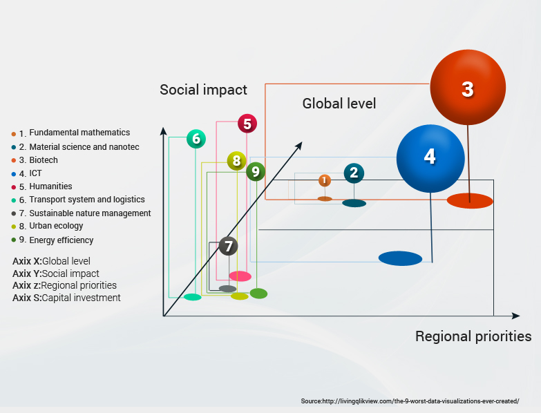
Can you understand what your analyst is trying to convey here?
Well, it’s not him. It’s the data visualizations that he needs to improve on.
What is Good Data Visualization?
Data visualization is the skill and the art of presenting data in a way that a non-specialist can also understand the insights derived from data analysis on which the visualization is based.
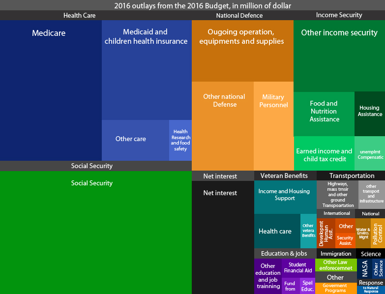
Data visualization doesn’t need to follow a pattern; you could make a two-dimensional (charts, bar-graphs, line graphs, data maps), a three-dimensional visualization (matrices, lattices, 3-D graphs, and charts), an interactive data visualization dashboard, or even a combination of all these modes. For example, the follow data visualization from the US Office of Management and Budget’s (2016) report during the Obama administration in the USA, is crisp and easy to grasp for everyone.
The rule of thumb here is that whichever visualization you use, your audience should be able to understand the intended message clearly and thoroughly. A viewer should be able to comprehend a visualization on their own and understand how something changes between the marked points.
Why is Data Visualization So Important?
Data is touted as the new oil. Organizations across spectrums are investing by the billion in understanding data better; hiring for roles like Chief Data Officers, Data Scientists, Data Managers more aggressively. The sole aim here is to ensure that the organization uses the available data to its full potential and makes informed decisions to boost market presence and profits.
Now, the raw data that organizations have is usually a combination of numbers and text. While a data scientist might be able to make sense of this data, it is rather tough for people in general. The marketing and sales department, finance department, HR departments, etc. can benefit immensely from the business intelligence insights from said data if they could readily understand it. This is where a good visualization comes in.
Data Visualization In Data Science
Today, internet users generate approximately 2.5 quintillion bytes of data every day, and unstructured data is swiftly outweighing structured data to the extent that 80% of all data generated is expected to be unstructured by 2025.
While everyone working with data should know the art of data visualization, it is even more crucial for people working on a data science project. Along with colossal amounts of data, a data science project’s target audience are always people who are not familiar with the antics of data science, such as marketing managers, trends analysts, sales managers, clients etc.
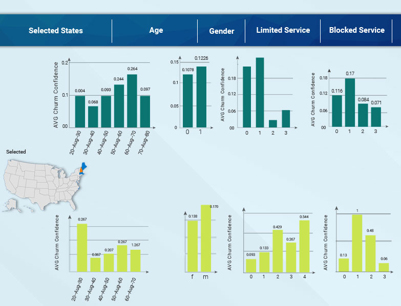
To help these stakeholders understand the observations and predictions from the data science projects and how these insights interact with each other, the best way is to visualize the information. Visualizing insights and outputs from a data science project will attract For example, it is much easier for stakeholders to understand the visualization below than looking at a spreadsheet and making a decision.
Further, the data scientists can also utilize data visualization techniques to better understand the patterns in their data.
Takeaway
Today, a higher percentage of all data generated is unstructured, and this percentage is set to keep increasing. Traditional methods of business intelligence generation and visualization are not capable of handling unstructured data. On the other hand, deep-learning-powered systems can process and understand this data and generate useful insights and visualizations without any human intervention.
Good data visualizations are essential for obtaining useful business intelligence. Hence, you must choose a robust and adaptive deep-learning-based data visualization system.